

I was contacted a week or so ago by a client who was trying to develop a page which allowed coaches to assign members of their sports teams to athleti/track and field events. The client wanted to do this via a drag and drop interface (something like this).
Now the thing with drag and drop is it looks very nice, and when the order of dragged items is important, it’s a good way of approaching it. My guess is that a solution to the problem with drag and drop would have got some ‘wow’ comments first time around, but the next time things would have become, well, a drag…
What we built was a pretty non-whizzy grid of athletes against events, with a checkbox for each combination:
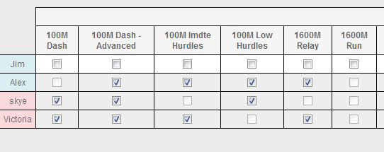
This is so much easier to use and allows the coach to either work through each event and assign all the required athletes, or work through each athlete and assign events. The client’s response: “I’m dancing around the office Gangnam style! This is absolutely awesome! Beyond expectations.”
A good example of where consideration of usability delivers the best result.
Tags: usability