There’s a number of approaches to implementing a mobile theme on Opencart. First off, let’s assume that you’re not just catering for mobiles, and that you want to make different pages available to mobiles.
Option 1 – Use a single responsive theme
In theory it’s possible to serve a single theme which will adapt itself to the screen size used via css media queries. Originally, this approach required too many compromises to result in a good experience all round. Media queries mean that you’re just displaying the page differently, but the html served to the page is identical, and hence there’s no way to avoid serving lots of big images to a mobile (or conversely, serving poor quality images to a desktop browser). With improved mobile networks, this is far less of an issue, and this is now my preferred approach. (The BBC, currently, are serving low quality images and then using js to add better quality images dependent on screen size, resulting in a horrible experience on a desktop. Hum.)
Option 2 – Create a separate store that uses a mobile specific theme
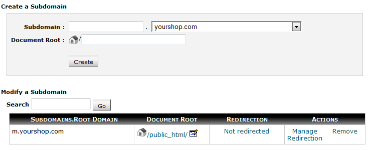
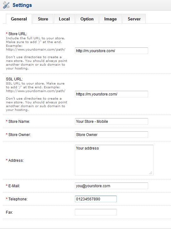
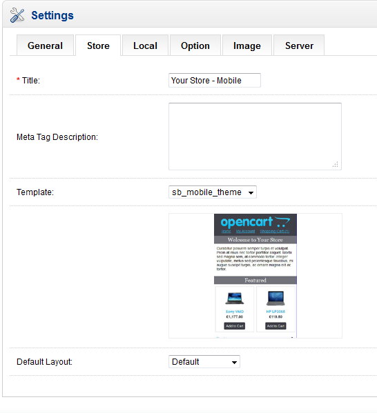
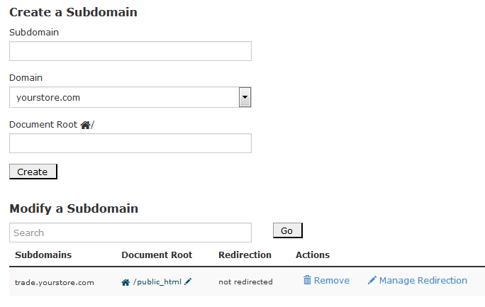
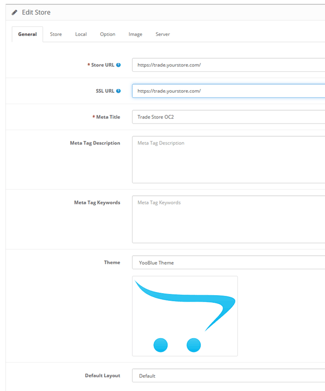
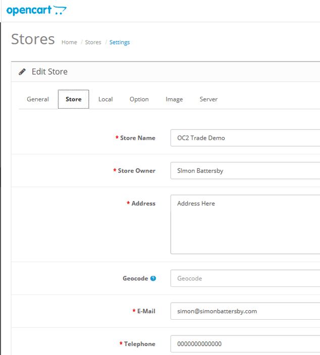
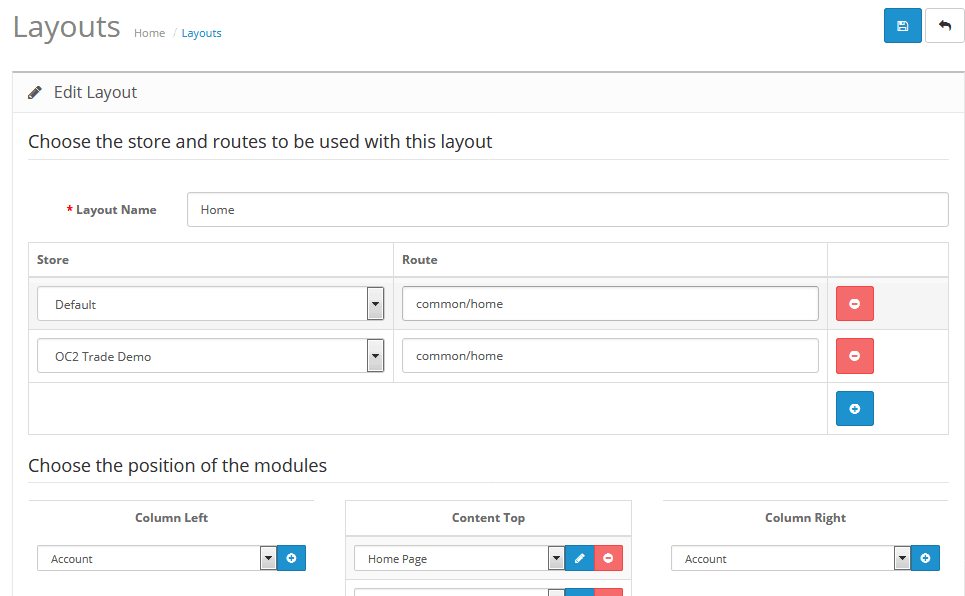
Once you take this step (instructions here) then there are again some options as to how this is implemented. For the purposes of this document I’ll assume a main store set up on http://www.mystore.com and a mobile store on http://m.mystore.com. The mobile store has id=1 within Opencart.
Option 2A – Detect the mobile browser using PHP
There are a number of mobile browser detect scripts out there. These attempt to identify a browser as coming from a mobile from the header information passed from the browser when it calls the page. I tried using the Mobile Detect class. This is simple to use. I stored the Mobile_Detect.php file in the root of my store, and included the following code (in red_ in catalog/controller/common/home.php:
class ControllerCommonHome extends Controller {
	public function index() {

		include $_SERVER['DOCUMENT_ROOT'].'/Mobile_Detect.php';
		$detect = new Mobile_Detect();
		if ($detect->isMobile() && !$detect->isTablet() && $this->config->get('config_store_id')!=1){
			header('Location: http://m.mystore.com');
		}

		$this->document->setTitle($this->config->get('config_title'));
So, I’m calling the Mobile_Detect() class, and from the results of that, if it’s a mobile, and if it’s not a tablet, and if it’s not already the mobile store (identified by store_id = 1 here, check your own installation), then I’m redirecting to the mobile store homepage.
This works fine, and redirects all calls to the default store homepage only from a mobile (phone) to the mobile store. You could use similar code in catalog/controller/common/header.php to redirect any page to its mobile equivalent. Something like:
class ControllerCommonHeader extends Controller {
	protected function index() {

		include $_SERVER['DOCUMENT_ROOT'].'/Mobile_Detect.php';
		$detect = new Mobile_Detect();

		if ($detect->isMobile() && !$detect->isTablet() && $this->config->get('config_store_id')!=1){
			if (isset($this->request->server['HTTPS'])) {
				$mobile_redirect = 'http://m.mystore.com';
			} else {
				$mobile_redirect = 'http://m.mystore.com';
			}
			if ($_SERVER['REQUEST_URI']) $mobile_redirect .= html_entity_decode($_SERVER['REQUEST_URI']);
			header('Location: '.$mobile_redirect);
		}

		$this->data['title'] = $this->document->getTitle();
Here I need to additionally construct the URL to redirect to from the entered URL. I’ve tested this across a number of pages, both with and without SEO URLs, and it seems to work fine. I don’t have access to a test server with SSL enabled, however, so be warned…
A potential issue here is that the customer doesn’t really know what’s happened to them, and worse, they can’t get back to the main store, because they’ll always be redirected. The other downside is that the redirect itself relies on accurately detecting the device from the headers. A glance at the code in Mobile_Detect.php reveals a whole list of device identifiers that is going to become outdated at some point, leading to incomplete redirections. While it’s quite neat (at least at the moment), I’m not keen on the inflexibility.
Option 2B – Detect the mobile browser using javascript
It would be possible to detect the screen width of the browser, and redirect to your mobile store if the width is less than a certain value. If you just want to implement this on your home page, then it’s quite simple – just add the following to your default store home.tpl:
<script type="text/javascript">
if (screen.width <= 699) {
window.location('http://m.oc1531.simonbattersby.com');
}
</script>
If you want to redirect every page it get's messy, and it's easier I think to do some of the work in the controller - you could add the following to catalog/controller/common/header.php:
		if (isset($this->request->server['HTTPS'])) {
			$mobile_redirect = 'http://m.mystore.com';
		} else {
			$mobile_redirect = 'http://m.oc1531.simonbattersby.com';
		}
		if ($_SERVER['PHP_SELF']) $mobile_redirect .= $_SERVER['PHP_SELF'];
		if  ($_SERVER['QUERY_STRING']) $mobile_redirect .= '?'.html_entity_decode($_SERVER['QUERY_STRING']);
		$this->data['mobile_redirect'] = $mobile_redirect;
This is using the same logic to build the redirect URL as above. Then, in your default store header.tpl:
<script type="text/javascript">
if (screen.width <= 699) {
window.location='<?php echo $mobile_redirect;?>';
}
</script>
Using javascript has the advantage that you're just relying on the screen's width, and hence are not dependent on any list of browsers being kept up to date. I'm still not keen on the inflexibility however...
Option 2C - Let the customer choose
You could just let the customer choose which version they want to use...they'll always know if they're using a mobile or not (hopefully).
One way of doing this is to use Opencart's Store module, which will list all your stores and let the customer navigate from one to the other from a drop down menu. You could also just add a manual link (by editing header.tpl) to point at your mobile store.

