

Spent today mostly hacking the login/purchase forms to make them behave better, and removing the tables at the same time. Like this:


Not sure about the styling on those radio buttons at the moment….
Spent today mostly hacking the login/purchase forms to make them behave better, and removing the tables at the same time. Like this:
Not sure about the styling on those radio buttons at the moment….
Yesterday I started playing around with creating a version of our Opencart store suitable for mobiles. Here’s how I got on.
I began by considering the use of css @media queries to apply a separate css to be used on mobiles, but quickly discarded this approach as there was just too much data to fit on the screen. I then switched to the current approach, which is to create a new store within Opencart, and use a different theme wherever possible to render pages differently. Opencart is fantastic in the way it supports this – in five minutes I had two separate stores, running on m.mytestdomain.com and mytestdomain.com, bot using the same data and admin suite. Further, Opencart allows the use of separate categories and products by store – so I can use categories with less products on the mobile store only to limit the amount of scrolling – one of our live categories has 59 products in it.
I’ve been trying, wherever possible, to restrict mobile-specific code to the theme itself, so as not to compromise maintainability. However, after some experimentation I decided that I wanted to display a full list of categories and products on the home page, but not at all on subsequent pages, and this required a change to catalog/controller/common/column_left.php so that I can identify whether the rendered page is the homepage or not. I used:
		$homepage = "/";
		$currentpage = $_SERVER['REQUEST_URI'];

		if($homepage==$currentpage) {
		$this->data['home'] = true;
		} else {
		$this->data['home'] = false;
		}
and then some conditional code on column_left.tpl to display the category module only on the home page (and not display any other modules at all).
So far, I’ve done the home page and category pages. I’ve removed all the tables encountered so far, ripped out all the extraneous stuff, and simplified wherever possible. Here’s what the pages look like so far, some more styling needed (screenshots using http://www.iphonetester.com/).


Quite an interesting and thought-provoking challenge to minimise the size of the pages. The home page is currently less than 20k and loads noticeably quicker than the main site home page, even over my broadband link.
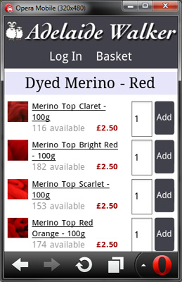
Been fiddling about with the layout again today and having checked the site on another emulator I’ve decided I need to rework the category page to make the image smaller, otherwise I’m struggling with room again. It would be quite nice to have a product image that isn’t square, but it seems Opencart doesn’t like images that break the original aspect ratio. Fair enough. Although the revised image fits better it doesn’t look as nice I think. I can feel the temptation to use tables to layout the category grid – am trying to resist this.
Anyway, here’s the latest iteration, tried the Opera Mobile Emulator today:
I’ve been examining the CostCo mobile site as that was well-rated on a site I was reading, but I spotted this afternoon that if you go down the navigation until you actually get to a product detail page, then it links to the main site, so you can’t actually buy anything direct from the mobile site. Seems odd.
To do list: I think the main menu (see previous post) could actually manage with links that are less deep, and I’m also thinking about reducing the header size to fit the “My Account” and “Basket links” alongside it, also think the input fields on that category page are too large.