Web Design and Build

Creating a mobile version of an Opencart shop – 8 Last updated:15 March 2012

So, the mobile pages are now live! You can see the live site here. Please bear in mind this is a live site, please don’t enter customer data unless you actually want to buy something!

I’ve put together a summary of the changes made to the theme, plus the files here.

Creating a mobile version of an Opencart shop – 7 Last updated:9 March 2012

With a bit of help from some friends, I’ve now had the site tested on a couple of real mobile devices, with pretty positive feedback. The exception however was the button styling. The image below shows the button on the main (non-mobile) site, then the button on the mobile site, and finally the button as displayed on an iPod:

Opencart buttons - that displayed on an iPod shows an oval button on top of a square button

My first thought was that somehow, the image from the main site was being superimposed on the coloured background from the mobile site. But it wasn’t anywhere in the css. Very puzzling. I finally twigged that it isn’t the main site background image, it’s the default input button used by Mobile Safari unless explicitly removed. Applying this css got rid of it:

input{-webkit-appearance:none;}

Needless to say, this problem didn’t show up in any emulator I used….

Next step I think will be to launch this and invite comments from users. Should be interesting.

Creating a mobile version of an Opencart shop – 6 Last updated:25 February 2012

I should have said, if anyone’s reading this and would like to have a look at the test site, it’s currently available at:

m.testshop.simonbattersby.com

Note you won’t be able to checkout at the moment as it’s pointed at the Paypal sandbox. At the moment at least I’m more concerned with the usability of the site anyway. If you do view the site then any and all comments are welcome. If you see a problem, do let me know – it would be helpful to know the model of phone with which you viewed it. Thanks!

Opencart and support for javascript disabled Last updated:23 February 2012

I realised recently that my Opencart installation does not allow users to checkout if they have javascript disabled. It’s a little unfortunate because there’s no warning of this at all to the user – you can fill your basket OK, and then you’re stuck. This is a shame since otherwise I like Opencart, it’s pretty easy to configure once you’ve got the hang of its MVC architecture. These threads on the Opencart forum make it look like this isn’t likely to change.

Now, not many people are going to have their js disabled, but do we really want to disenfranchise the few, or even one, that do/does? I think not.

There are two situations where Opencart uses javascript on navigation. The first is for a simple link:

<a onclick="location = '<?php echo str_replace('&', '&', $back); ?>'" class="button">

This is simply fixed by making this:

<a href="<?php echo str_replace('&', '&', $back); ?>" class="button">

The other situation is slightly more complex and happens where forms need to be submitted. As a default Opencart has, for example:

<a onclick="$('#payment').submit();" class="button"><span><?php echo $button_continue; ?></span></a>

The quick and dirty solution is to replace this link with a “normal” input tag of type submit. However, these are more difficult to style. Conseqeuntly, I’ve amended the html to:

<span class="button hide_js"><input class="hide_js" type="submit" value="<?php echo $button_continue; ?>"/></span>
<a onclick="$('#payment').submit();" class="button show_js"><span><?php echo $button_continue; ?></span></a>

with some simple jQuery, which I’ve added to ajax_add.js:

	$('.hide_js').hide();
	$('.show_js').show(); 

and this css

show_js{display:none}

So, for a user without javascript, the link which relies on javascript is hidden by the css and a simple input button is used instead. For a user with javascript enabled, on page load the input button is hidden and the javascript link displayed. Using OC 1.4.9.5 I found one situation where the form does not extend to include the div which contains the button – I just extended it so it did.

With a bit of judicious css, the “non javascript” buttons can be virtually identical (not pixel perfect) to the javascript ones – that’s why I’ve wrapped the inputs in the span as shown above, and then extending the styling used for .button span to include .button input.

Update 23 February: I subsequently spotted another issue with javascript disabled which is that it’s impossible to select the zone in an address since this is populated only by javascript. Fixing this is slightly more complex – see this post.

Creating a mobile version of an Opencart shop – 3 Last updated:23 February 2012

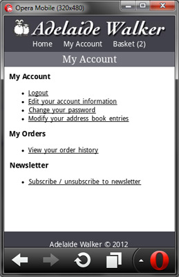
OK, so today I’ve reworked the header links to include a Home link but remove the Logout link – I’ve moved the latter to sit under My Account.

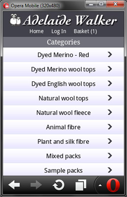
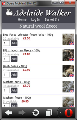
I’ve also redone (again..) the category page, having given up trying to fit everything onto one line, quite pleased with the result.

I also copied across all the products from the base store to the mobile store, using, for example, this SQL:

CREATE TEMPORARY TABLE tmp SELECT * FROM oc_product_to_store WHERE store_id = 0;

UPDATE tmp SET store_id=2 WHERE store_id = 0;

DELETE FROM oc_product_to_store WHERE store_id=2.

INSERT INTO oc_product_to_store SELECT * FROM tmp WHERE store_id = 2;

This needs repeating for oc_category_to_store as well. My initial thoughts on categories was to create some different categories to avoid masses of scrolling, but I’m thinking in fact that this may be handled just as well by the inbuilt pagination.

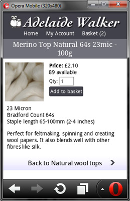
I’ve also added a “back to category” link to the product page and restyled that, removing all the tables.

And finally, styled the home page links so they look a bit nicer. Not sure at the moment whether having those links full width will get in the way of scrolling the page up and down. Results below:

Reworked home page Reworked category page Product page Reworked My Account page

Looking at these screenshots I realise I now have space to make the button on the category page larger again, also wonder whether the links on the My Account page should be buttons like the home page.