IE6 and the 3px bug
Let’s assume I’m building a simple 2 column layout. I want my left column to be 200px wide and my right column to be 600px wide, so they sit next to each other in an 800px wide wrapper. My html might look like this:
<div id="wrapper">
<div id="left"></div>
<div id="right"></div>
</div>
and my css might look like this:
#wrapper {width:800px}
#left{float:left;width:200px;height:100px;background-color:red}
#right{margin-left:200px;width:600px;height:100px;background-color:blue}
So this should be fine because 200px+600px=800px and the two columns fit neatly and precisely within #wrapper. So in IE7, IE8, Firefox 2, Firefox 3, Chrome, Safari4 and Opera 9 it will look like this:

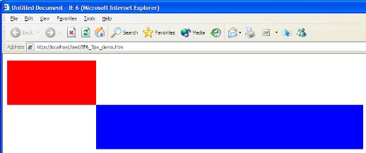
But IE6 adds an extra 3px gap to the right of #left, leaving only 597px for #right to fit in. #right is too big, so the whole of #right drops – “float drop” – and your nice design’s a disaster. Like this:

This is a particularly cunning bug, in my opinion, since in this circumstance the dropped element then sits right up against the floated one and there’s no obvious gap and no clue as to why it’s all gone wrong. There’s a couple of solutions, fortunately.
If your design allows it, the easiest fix is to just remove the width from #right and allow it to effectively be a bit narrower in IE6 than in everything else. This won’t work in lots of cases if you’re using background colours or images, however. It wouldn’t work in my example above because there would be a 3px white gap between the two columns. In this case the best solution I’ve found is to float both columns, so my example css becomes:
#wrapper {width:800px}
#left{float:left;width:200px;height:100px;background-color:red}
#right{float:right;width:600px;height:100px;background-color:blue}
There may be times when you can’t float both columns, for example if the right column has a fluid width. In this case the problem can be tackled with conditional comments for IE6 only. A 3px negative margin needs to be applied to the floated element, and the margin on the non-floated element needs to be reduced by 3px to match. So, my example css becomes:
#wrapper {width:800px}
#left{float:left;width:200px;height:100px;background-color:red}
#right{margin-left:200px;height:100px;background-color:blue}
This will apply to all browsers, but I’ll target IE6 with this css as well:
<!--[if IE 6]>
<style type="text/css">
#left{margin-right:-3px}
#right{margin-left:197px}
</style>
<![endif]-->
I’ve created a demo page here, if you want to see this for yourself.

Спасибо! Thank you from Russia!
many thanks
Well done sir. You are a lifesaver.
Thank you
Thank you
Thank you
a thousands times
Thank you